From clear plan to a brand that breathes confidence
HR Professionals
Project: A strategic rebranding: from positioning and visual identity to website, communication tools and content structure.
Goal: Building a brand that reflects the quality and accessibility of HR Professionals. Warm, professional and reliable, exactly what their customers expect from a modern HR partner.
How do you give a growing HR brand an appearance that both inspires confidence and immediately appeals to your target group?
By building a brand that radiates calm, clarity and decisiveness.
For HR Professionals we developed a solid strategic foundation, a new visual identity, a clear website and communication expressions that all say one thing: this is a partner that stands for quality and people work.
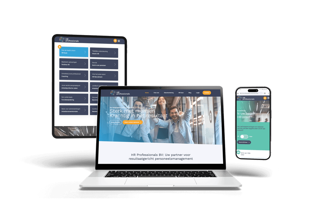
Visual identity
Wireframes
UX design
Web design


Roel Sloesen
Linda Cupers
Bob Wetzels
Eveline van den Wijngaard
Hayke Pouwels
-
challenge
From 'almost' to 'absolutely'
The challenge:
HR Professionals has been delivering strategically strong and practical HR solutions for SMEs for years. But the brand appearance lagged behind the quality of their service delivery. How do you build a brand that feels both professional and personal and immediately inspires the confidence you expect from an HR partner?
Objectives:
Align the brand with the quality and professionalism of the organization.
Profile more clearly as the HR partner for SMEs.
Establish a recognizable and accessible appearance. Online and offline.
-
approach
From strategic foundation to recognizable brand identity
We started with a strategic marketing plan focusing on positioning, target group focus and growth objectives. Important insights were directly translated into a brand story that radiates calm, clarity and expertise.
An important part of the strategy was the introduction of the HR scan: a low-threshold, smart tool to let organizations get acquainted with HR Professionals.
The new brand identity was built around three core values:
Reliable – a partner that stands for quality.
Accessible – close, people-centered and warm.
Professional – with expertise and attention to detail.
We developed:
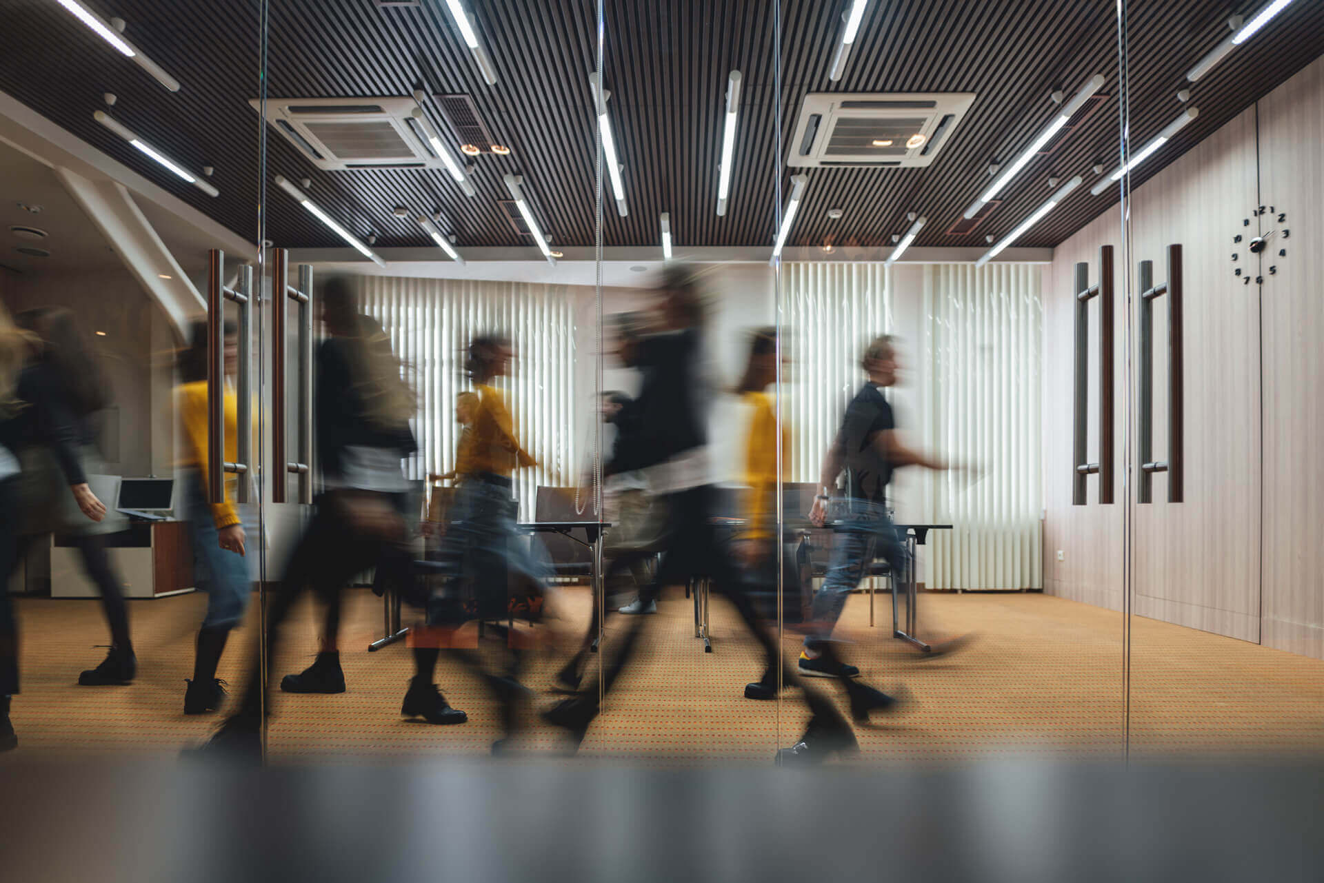
A fresh visual style with soft colors, open typography and warm photography;
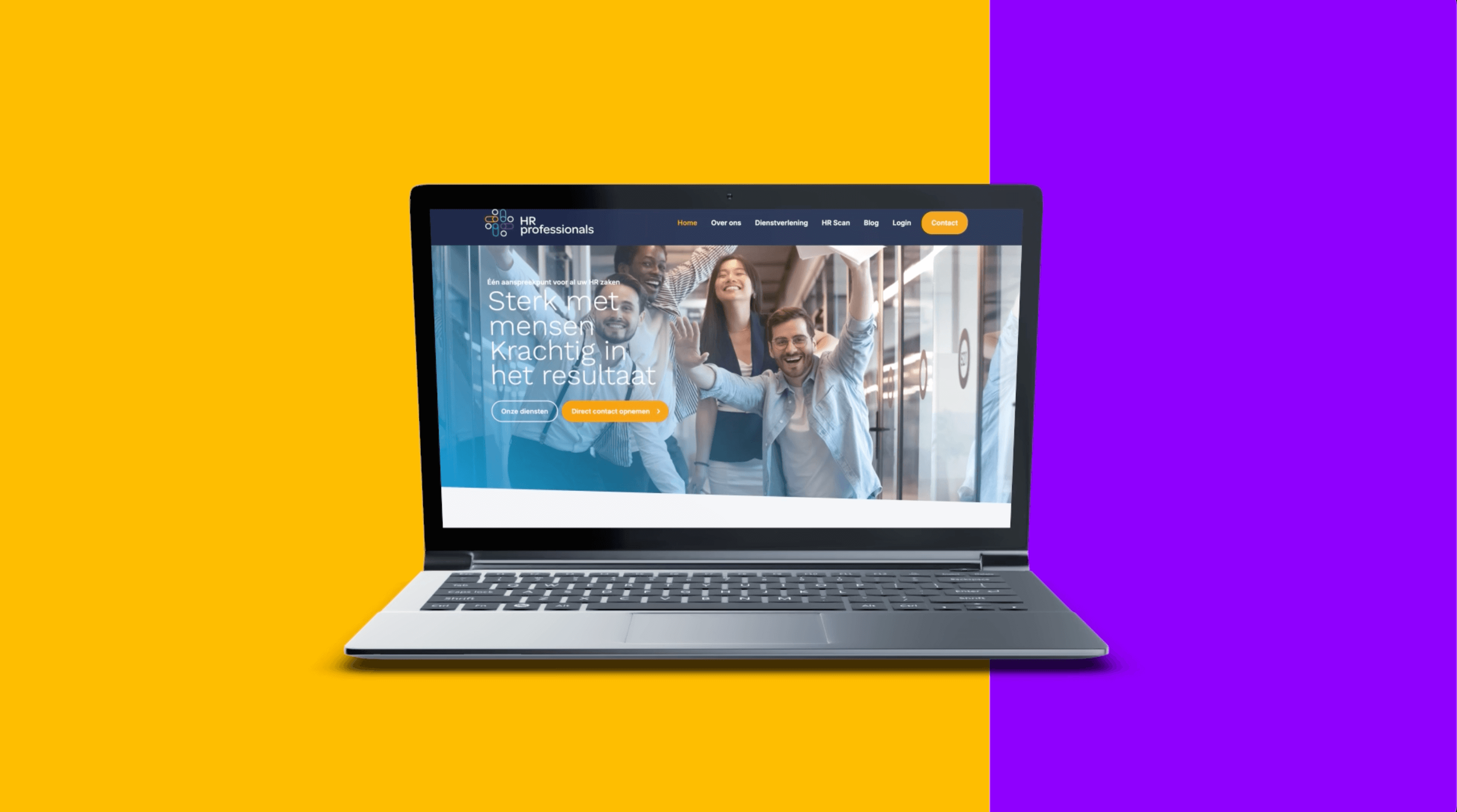
Wireframes and web design focused on overview, user-friendliness and conversion;
Offline communication tools such as business cards, letterhead and email signatures in line with the new identity;
A proposal for photography and content structure that emphasize the human character of the brand.
-
result
A brand that feels like how they work
With the rebranding, HR Professionals now radiates what they have always stood for: human, knowledgeable and close. Customers recognize themselves in the brand and new contacts immediately get the right feeling about the organization.
Concrete results of our approach:
Stronger brand appearance: professional and warm, exactly what customers look for in an HR partner.
More recognition in the market: the positioning seamlessly aligns with the needs of SMEs.
Better foundation for acquisition: the HR scan as an effective tool for new client conversations.
A consistent brand experience: both online and offline, the brand is perfect down to the detail.


Time for a brand that matches the quality
HR Professionals is the external HR department for organizations without their own HR team. From a network of regional specialists, they offer customization, strategic advice and practical solutions.
There was just one challenge: their appearance didn't yet do justice to the professionalism and experience they bring. So the question to us:
Help us build a brand that shows who we are and what we stand for.
The approach: from strategy to recognizable brand identity
We kicked off with a strategic marketing plan focusing on positioning, target group and growth objectives.
With core points:
More recognition as the HR partner for SMEs
Introduction of the HR scan as a smart acquisition tool
Based on these insights, we developed a new corporate identity that stands for reliability, accessibility and professionalism. Color use, typography, tone of voice and photography seamlessly align with a modern HR partner that stays close.
Warm, friendly and consistent with a visual style that makes the brand recognizable on every channel.
From concept to realization
Digital and physical implementation
We implemented the new brand identity in both online and offline resources, including:
Wireframes and web design: focused on clarity, trust and conversion
Business cards, letterhead and email signatures: professional and stylish
Proposal for photography & content structure: tailored to the new brand positioning
A brand that shows what they're worth
With this rebranding, HR Professionals now has an appearance that strengthens the content. The foundation for growth has been laid, both in brand experience and commercial strength.
From 'almost' to 'absolutely'. Exactly as it should be.
creating impact
together!
Want to brainstorm or discuss a creative approach?
We are ready for you.
Stradigi and HR Professionals developed together
a brand positioning that radiates calm, clarity and
confidence, with an appearance that matches
the quality and human approach of their service delivery.